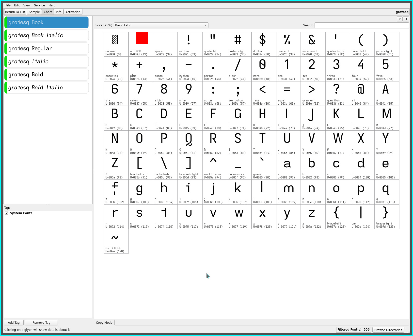
grotesq font
early on in this dyslexic font journey, a universal grotesk font variant was created with its unique descending lower case f, aptly named grotesk whilst applying the signature non-mirrored glyph set common to the fonts created on this site.
The grotesq font adds this glyph to the lajt font with its latest edition of the non-mirrored dyslexic glyph set which, with the descending capital J, imparts a “script like” flair to the font (reminiscent of cursive descenders)..

NOTE: the extended lower case f artifacts as shown above, are the font viewer app’s interpretation of the glyph customizations (to extend both the stem and hook separation) and are not visible in use.
non-mirrored glyph sets
continue to be the hallmark of the dyslexic fonts developed on this site.
Two sets of non-mirrored glyphs now exist: those prior to—and including the luft and lift fonts—and those belonging to the recent quad of fonts—laft, lait, lajt and grotesq fonts—which introduced the tailed lower case a and d glyphs and the resultant alternate glyph shapes improving (IMO) their non-mirrored visual differentiation and flow.
For the lower case b d p q..
| glyph | grotesq font | lift font |
|---|---|---|
| b | toothless-corner | toothless-rounded |
| d | tailed | toothed |
| p | eared | earless-corner |
| q | hook-tailed | hook-tailed |
The non-mirrored lower case m n u remain unchanged..
| glyph | grotesq font | lift font |
|---|---|---|
| m | earless-rounded | earless-rounded |
| n | straight | straight |
| u | toothless-rounded | toothless-rounded |
distinctive glyph flares
| glyph | grotesq font | lift font |
|---|---|---|
| G | toothed-hookless | toothed-hookless |
| I (eye) | serifless | serifed |
| J | descending-serifless | flat-hook-serifless |
| B P Q R | open | open |
| a | double-storey-tailed | double-storey-toothless-corner |
| f | flat-hook-extended | flat-hook |
| l (el) | extended-serifless | extended-serifless |
| t | hookless-asymmetric | hookless-asymmetric |
Refer to the laft font for the glyph variations distinguishing the laft, lait and lajt fonts (notably the capital I and lower case a).
‧ ‧ • ‧ ‧
This latest set of fonts with the minor tailed glyphs marks a significant departure from the prior sans serifed oriented typefaces. The fonts still reflect a sans serif slant but loosening this constraint introduces a pleasing visual flow (with imperceptible impact to the overall monospaced cell width character of the fonts) further relaxing (IMO) the visual effort to consume printed content.
The extended lower case f is reminiscent of the Universal Grotesk variants created very early on—an aesthetic return?—loosing some of the sans serifed glyphs in favour of visual flow and non-mirrored glyph shapes. Combined with the descending capital J, the subtle counterpoints to the extended lower case l render a pleasing visual (height/depth) balance to text lines.
Every typeface created, of course, quickly becomes a favourite for reading with, the nature of novelty.. but grotesq feels like a cumulative end game keeper :-)
My particular KOReader settings—font size, margins and line spacing—have elevated the grotesq font to a fiction favourite with its visual accent of occasional descenders. As always, YMMV.
repos
This font may be found on OneDrive.